5 tips to nail the pattern clashing trend
1- Be bold
This is a maximalist trend so, to use it successfully in your home, you must embrace the maximalist spirit. Pick statement patterns with bright colours rather than subtle prints in a muted palette. Think art deco interiors and Great Gatsby parties. No print is too bold, no embroidery too colourful, but you still must follow a few rules if you want to make the best of it.
Left: Kaleidoscope London house from shootfactory.co.uk
Right: Tawny wallpaper from modernnursery.com
2- Choose your themes carefully
From geometric to animal print patterns, there is a variety of patterns you can choose from. Here are just a few examples you could be using to create a vibrant room.
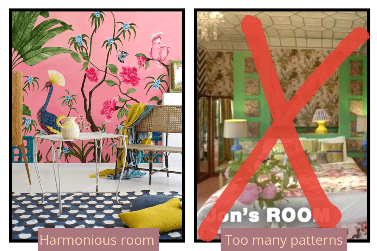
I think the key to succeeding at pattern clashing is to mix no more than 2 different type of patterns (especially if you are just starting out). Otherwise you can easily end up with a headache. Remember Jon’s hotel room in Season 2 of Interior Design Masters ? If not check it out. It’s a great example of what happens when you go a bit too far…
Left: Wallpaper by thebestwallpaper.com : this room uses a mix of floral and geometric patterns.
3- Stick to a colour palette
By using a consistent colour palette, presents in all the prints and patterns you’ve chosen, you have a lot more chance of reaching a successful end result.
Bellow, you can see how the same colours are repeated through wallpaper, accessories and flooring, making for a very successful kitchen decor.
Ariel Garneau’s house from hyggeandwest.com
4- Let it breathe
Pattern clashing doesn’t mean everything in your room should have a pattern on it or be super bright. It’s key to let your main pieces breathe and stand out.
By having objects or walls with plain colours, but in keeping within the colour palette you are using, you will create a harmonious room where your bold patterns will truly stand out.
Bedroom design by Laura U
5- Avoid chaos
This trend is about creating an interior that reflects your personality and that people will remember. But there is a difference between being loud and being messy. This is pattern clashing, not cluttercore.
Focus on a few key pieces rather than add a lot of random objects everywhere.
I promise you, you will feel better for it.
Left: Styling and print from maisonmargot.com
Right: example of the cluttercore aesthetic
6- My take
I made two examples of pattern clashing rooms.
The first one is for a maximalist living room with floral and tropical patterns. I used several floral pieces mixed with a bold tropical wallpaper. I also used bold accessories in keeping with the colour palette to accentuate the maximalist feel. I would definitely go for a plain white or green sofa, letting the bold pieces in the room sing.
Top left: Peony cushion by Andrew Martin ; Tropical wallpaper by WallFunk ; Top light: Coffee table by A Softer Edge
Bottom left: Statement lamp by pooky.com ; Bottom right: Floral rug by the shanti home
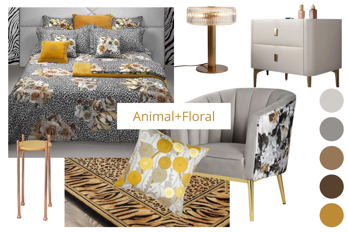
The second one is for a modern bedroom with a luxury hotel vibe. I’ve used animal print and floral patterns.
This room has a very different feel to the first one but the same principle for pattern clashing applies: keeping to a colour palette, using only 2 types of patterns, add plain touches and accessories.
Top left: Roberto Cavalli bed set ; Copper lamp by sohohome.com ; Bedside table by uk.homary.com
Bottom left: Copper plant stand by A Softer Edge ; Animal print rug by wayfair.com ; Floral cushion Husandhem.co.uk ; Grey and floral chair by dynamichomedecor.com
I hope you have find this article helpful and are now on your way to creating your own fabulous room using these pattern clashing principles.
Check out my other blog posts for more home decor tips and inspiration.
For more interior design ideas, make sure to sign up to my monthly newsletter 😉


